Build with confidence
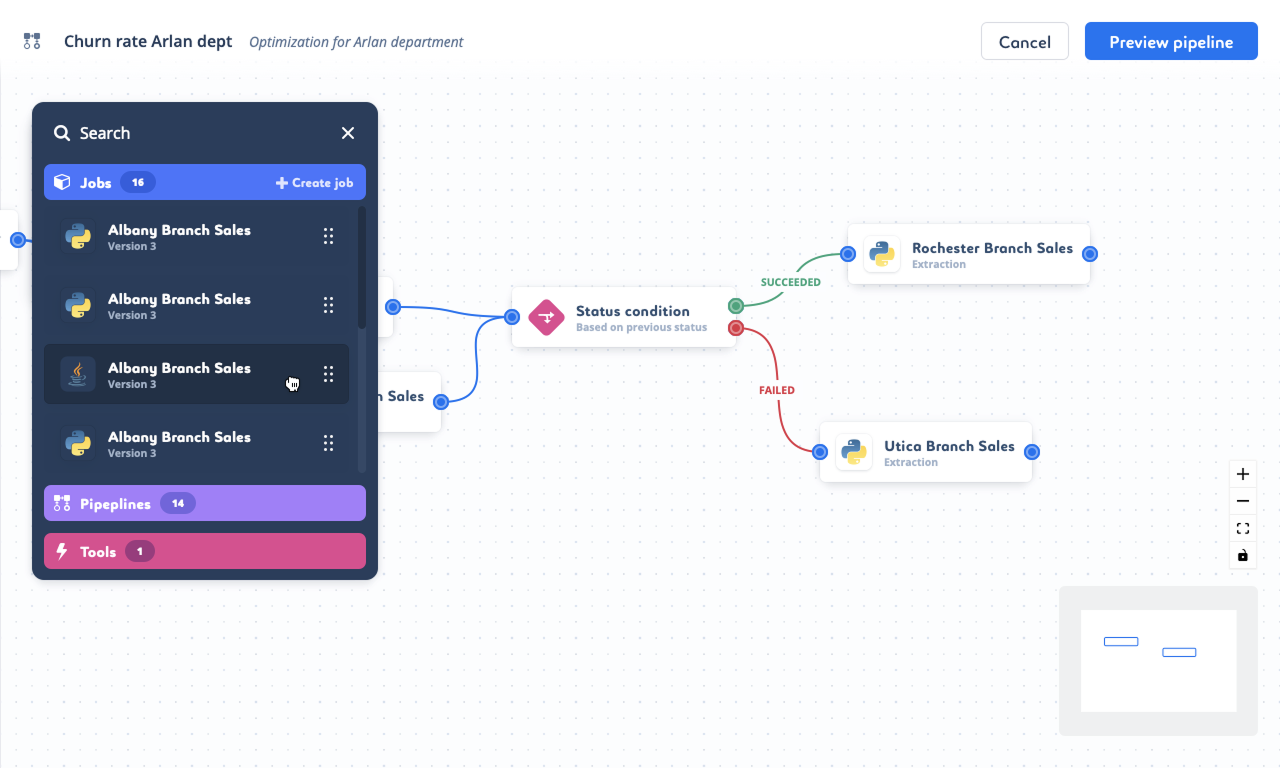
Understand pipeline structure and dependencies before running anything.
Saagie · Enterprise SaaS · Data / AI
I redesigned critical workflows so data teams could build pipelines, install applications and diagnose incidents with greater confidence.
Saagie is a hybrid-cloud data platform used to orchestrate data and AI pipelines across complex technical environments.
The platform delivered significant technical value, but key workflows exposed too much implementation complexity. Data engineers lost time to avoidable errors, unclear states and fragmented screens. The challenge was not to simplify the domain itself. It was to make that complexity readable and actionable.
For technical users, clarity means seeing the system without pretending the system is simple.
Understand pipeline structure and dependencies before running anything.
Find the right application and version without scanning repeated entries.
Understand what happened before, during and after an incident.
Move from fragmented workflows toward shared interaction patterns.
Pipeline creation originally relied on engineers writing a YAML file and uploading it to Saagie. Syntax errors were frequent, dependencies were hard to scan and debugging began before the pipeline even ran.
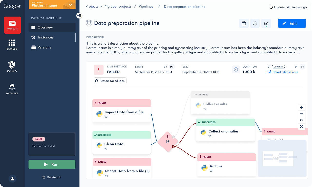
I designed a visual builder where teams could drag jobs and existing pipelines onto a canvas, connect them and model success or failure conditions directly. The interface made the underlying logic visible while preserving the flexibility technical users expected.
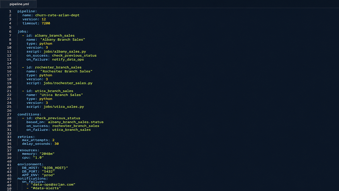
Valid connections and visible conditions replace fragile manual syntax.
The canvas makes job order, branching and failure paths scannable.
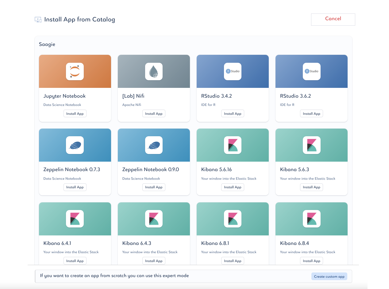
The application catalog displayed every available version as a separate card. The same products appeared repeatedly, users did not know which version to choose, and there was no direct search.
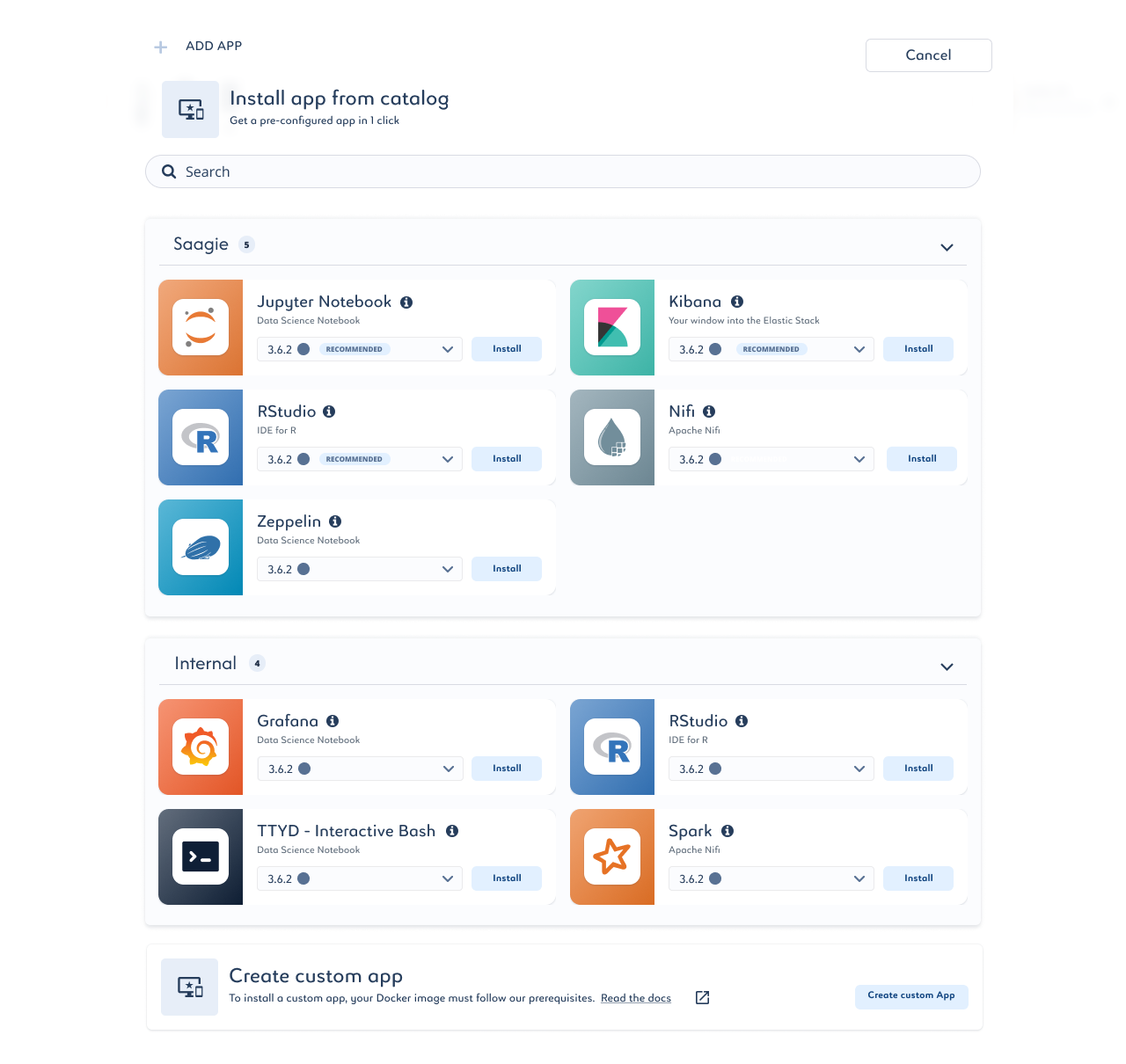
The redesigned catalog grouped versions under each application, separated Saagie and internal environments, recommended current versions and added search. The result was a shorter, more decision-oriented path to installation.
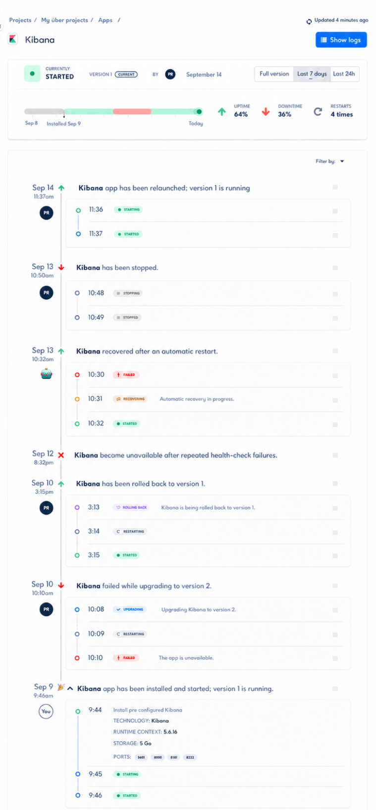
Data engineers had no consolidated view of an application’s state over time. When a pipeline failed, they had to piece together what happened and where to investigate.
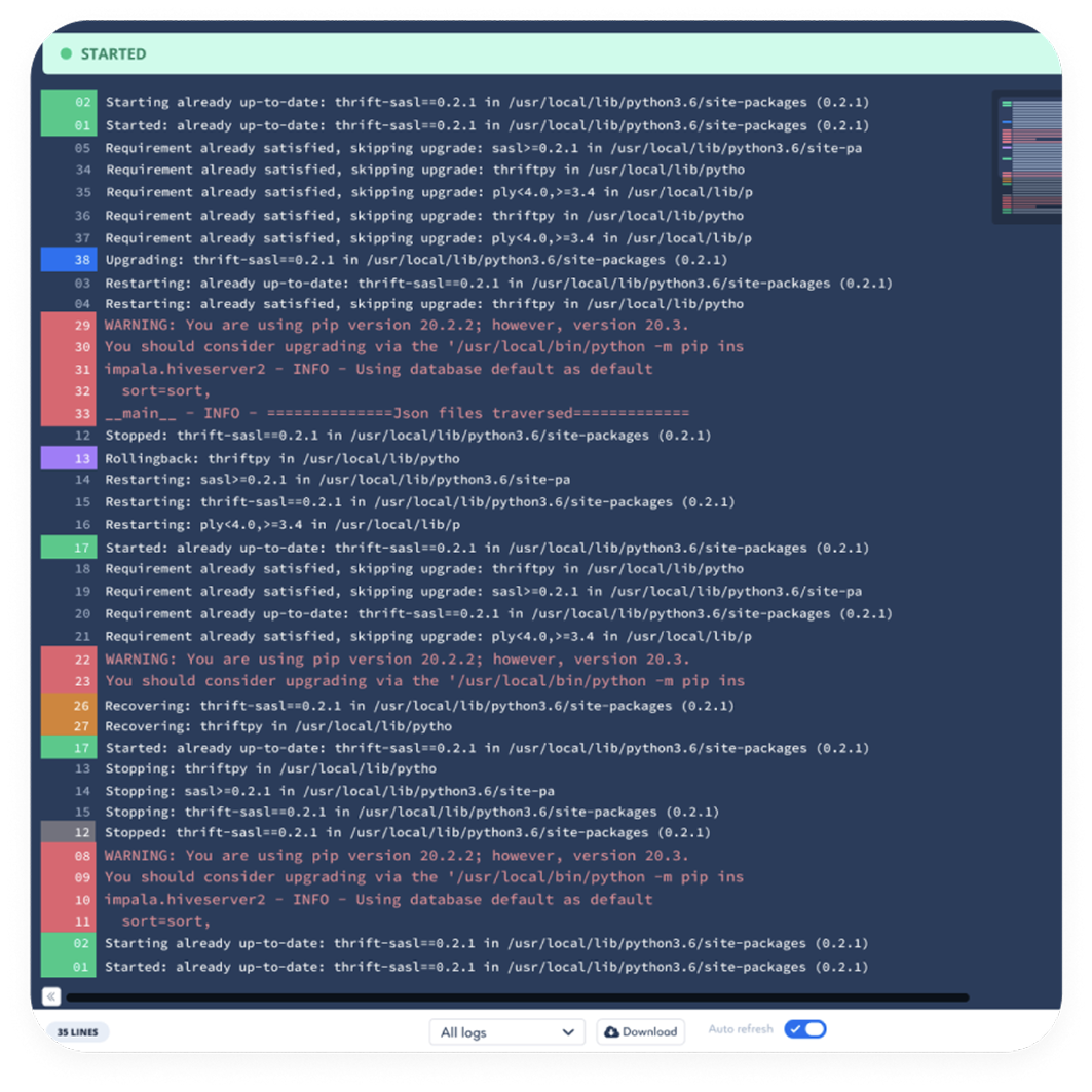
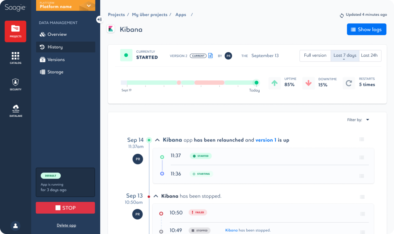
I introduced a chronological history of launches, stops, failures, recoveries and rollbacks. Downtime became immediately visible, durations were explicit, and engineers could move directly from a state transition to the relevant logs.
I worked with product managers, developers, data engineers, data scientists and analysts to map journeys and understand how each role interpreted pipeline structure and system state.
Prototypes and user testing helped us distinguish domain complexity that users needed from interface complexity the product had accidentally created. Alongside the flows, I maintained and evolved the design system so improvements could scale across the platform.
Concrete failures revealed where language, state and causality became unclear.
Spatial models and timelines made relationships easier to scan.
Clear status language supported both quick scanning and deeper diagnosis.
Shared components and patterns reduced fragmentation across workflows.
These additional views show how the same interface language supports teams across application monitoring, pipeline execution and job analysis.
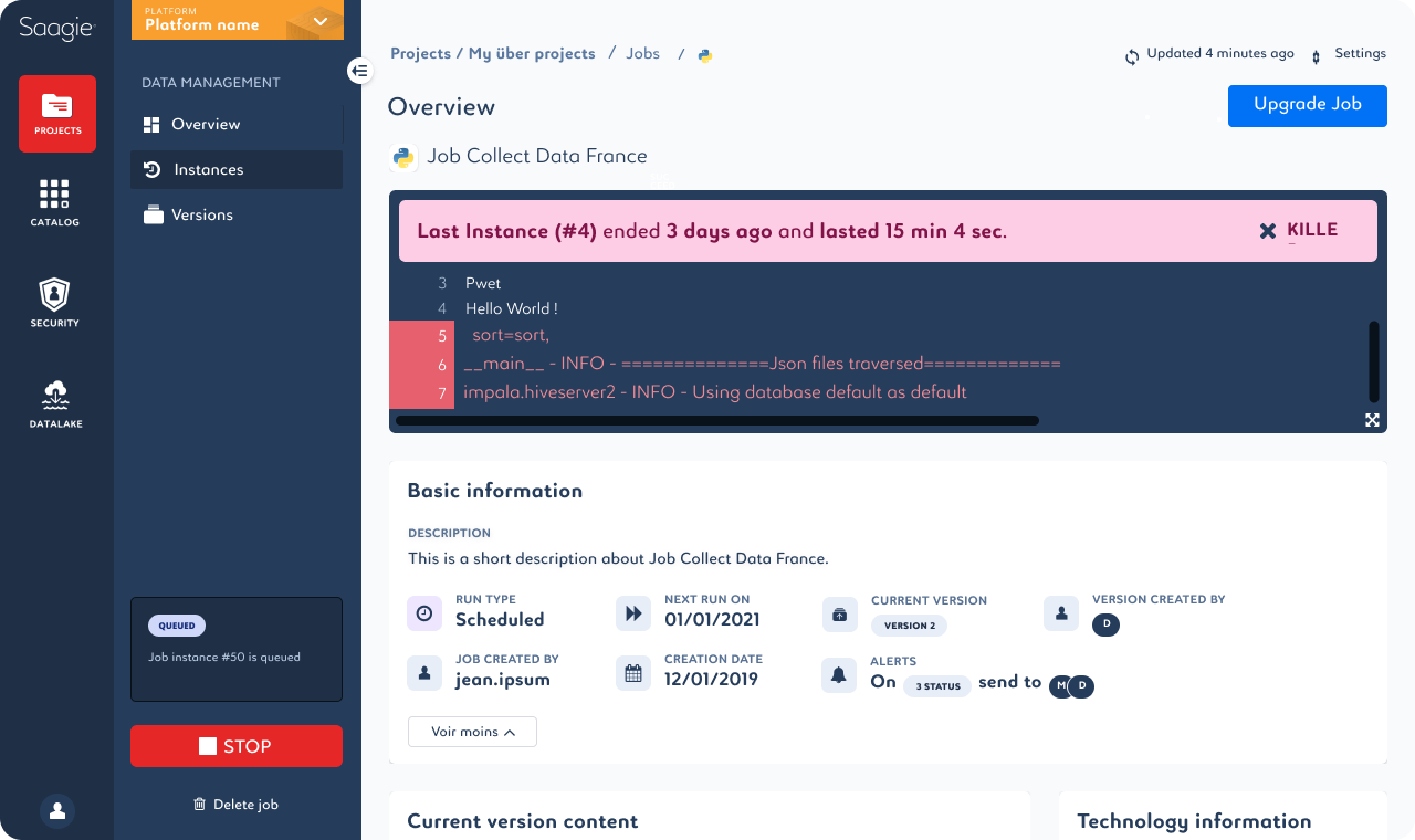
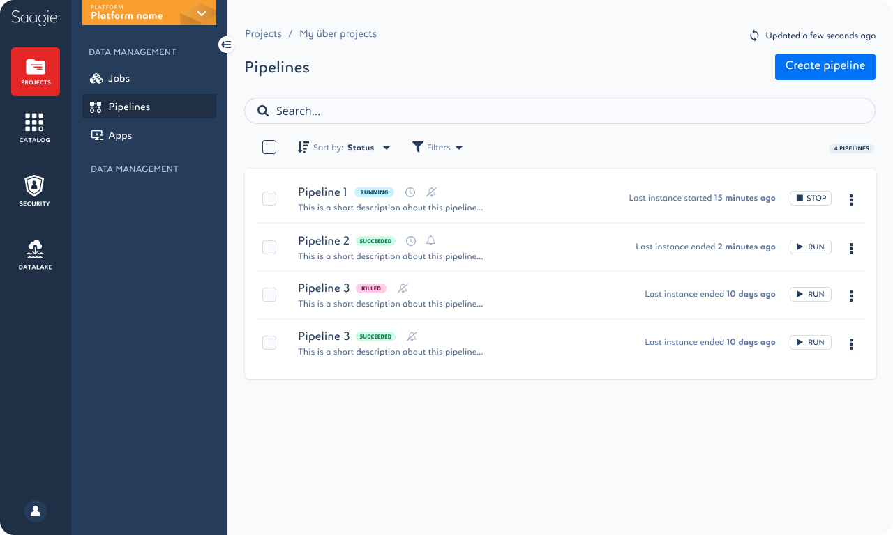
The redesign made technical workflows faster to scan and reduced the operational friction created by errors, repeated choices and missing system history.
Teams moved from fragmented screens and manual configuration toward clearer creation, installation and troubleshooting workflows, supported by a more consistent interface system.
The goal is not to make complexity invisible. It is to help people move through it with confidence.