An organisation that is hard to decode
Two logos, a long institutional name and the GCSMS acronym coexist without immediately clarifying who is speaking or who the website is for.
Groupement Autisme France · Website redesign · Health & nonprofit
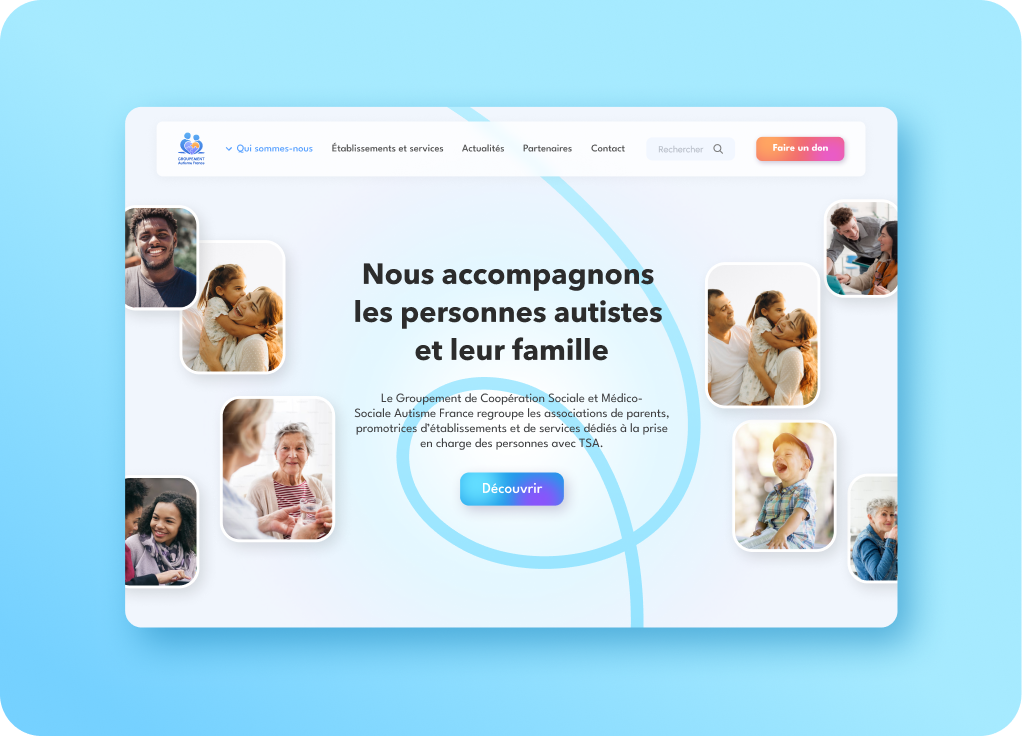
A national network supporting autistic people and their families.
Groupement Autisme France brings together health and social care organisations supporting autistic people and their families across France.
The website needed to explain the network’s role, help people find a local organisation, share news and provide access to useful resources. On the original homepage, some of that information was present, but its organisation made the essential journeys difficult to identify.
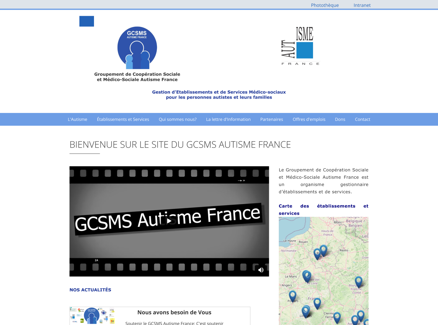 BeforeOriginal website · homepage
This initial interface review surfaced four working hypotheses to validate with the organisation’s teams and audiences.
Two logos, a long institutional name and the GCSMS acronym coexist without immediately clarifying who is speaking or who the website is for.
The many menu items carry the same visual weight. Finding a local organisation, understanding the support available or contacting the network do not stand out as key journeys.
Large empty areas sit beside denser copy, a map and news content. Information feels fragmented and the core proposition remains difficult to grasp.
Small text, light contrast in places and dense paragraphs make the service harder to read for the wide range of people it needs to reach.
To move beyond an expert-only reading of the website, I built the diagnosis with the Groupement Autisme France teams and the people directly concerned.
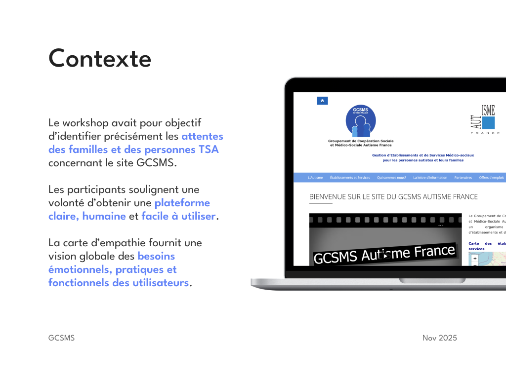
Interviews and workshops brought together project sponsors, professionals and users, including parents of autistic children. The goal was to understand their habits, the information they looked for, what blocked them and what could make the experience feel more reassuring and human.
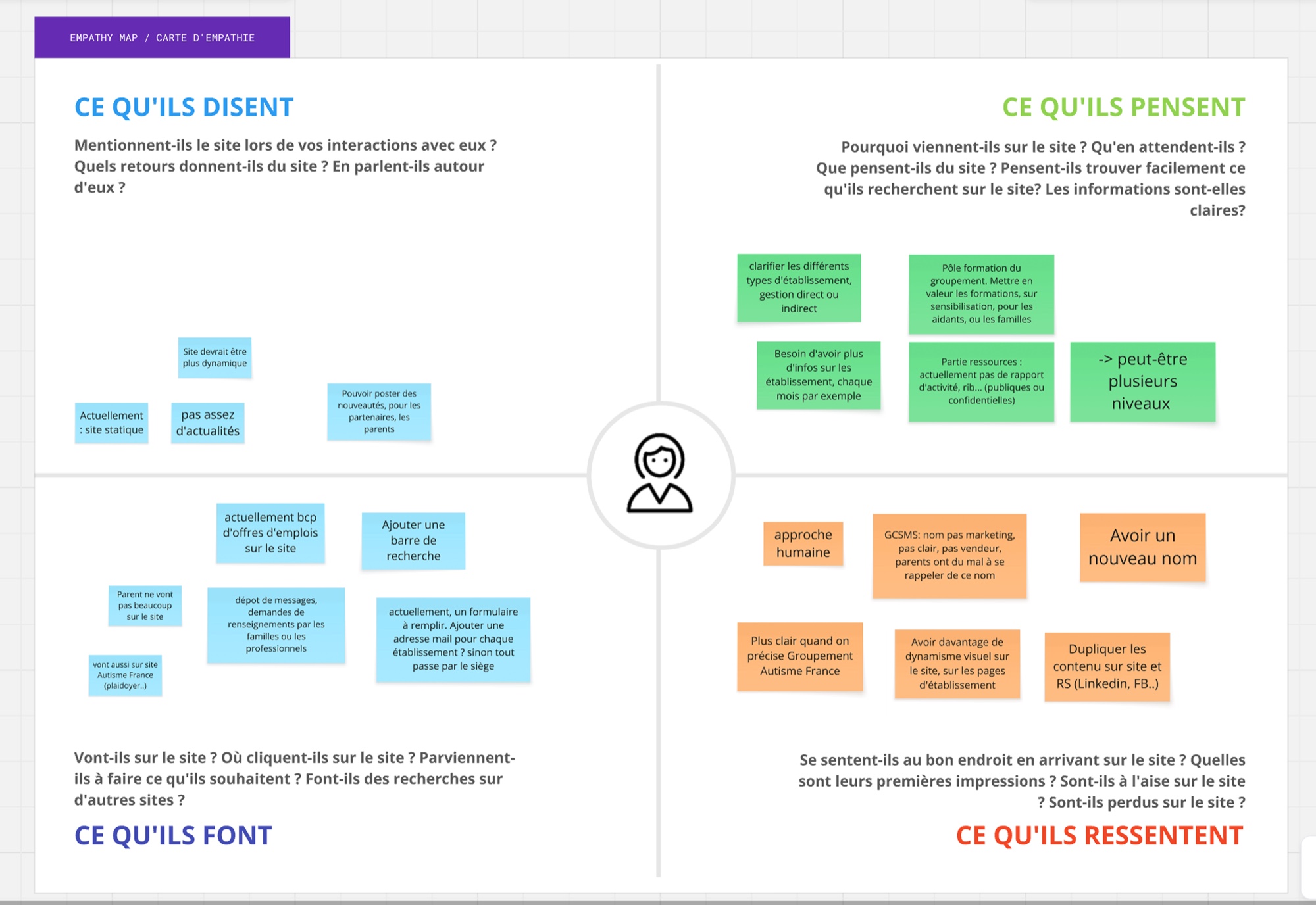
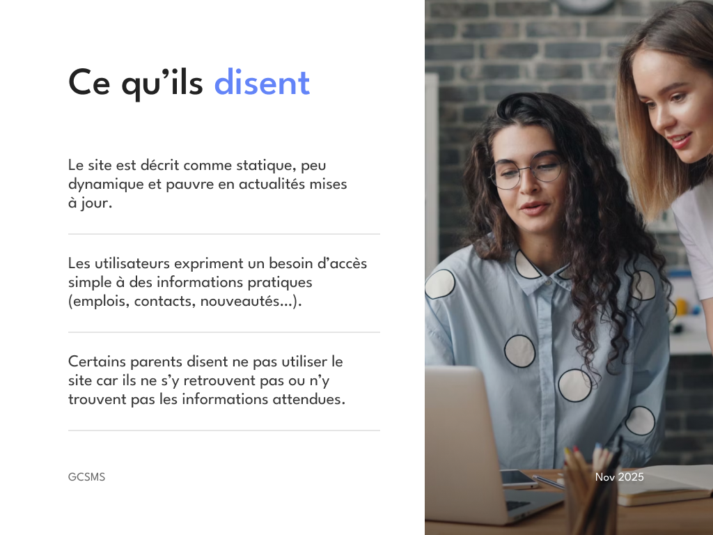
The empathy map connected what participants say, think, do and feel. It revealed a need for practical information that is easy to find, more active content and an identity that can build trust without losing the network’s institutional dimension.
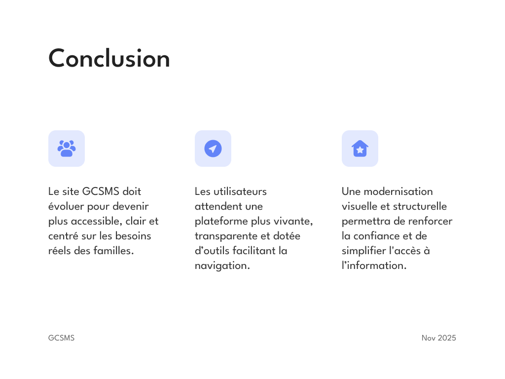
The playback aligned stakeholders around three directions: simplify access to practical information, make the platform clearer and more active, then modernise its structure and visual expression to strengthen trust.
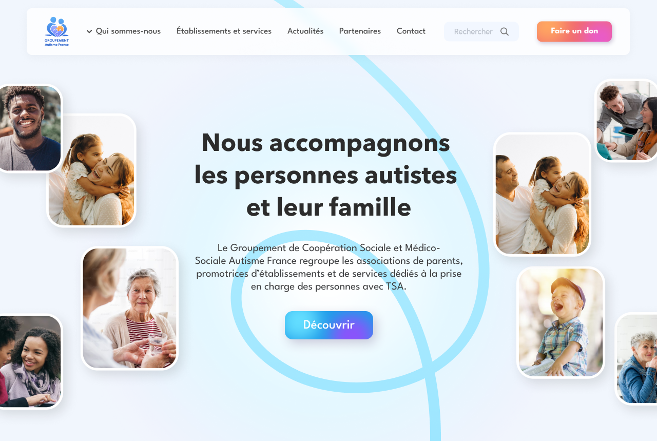
The redesign goes beyond modernising the interface. It turns an institutional website into a useful entry point for families, professionals and the organisations across the network.
The new architecture foregrounds the network’s mission, simplifies its main journeys and creates consistent signposts: visible search, accessible contact options and more direct navigation. The identity retains the blue historically associated with autism while placing it in a brighter, warmer and more contemporary visual system.
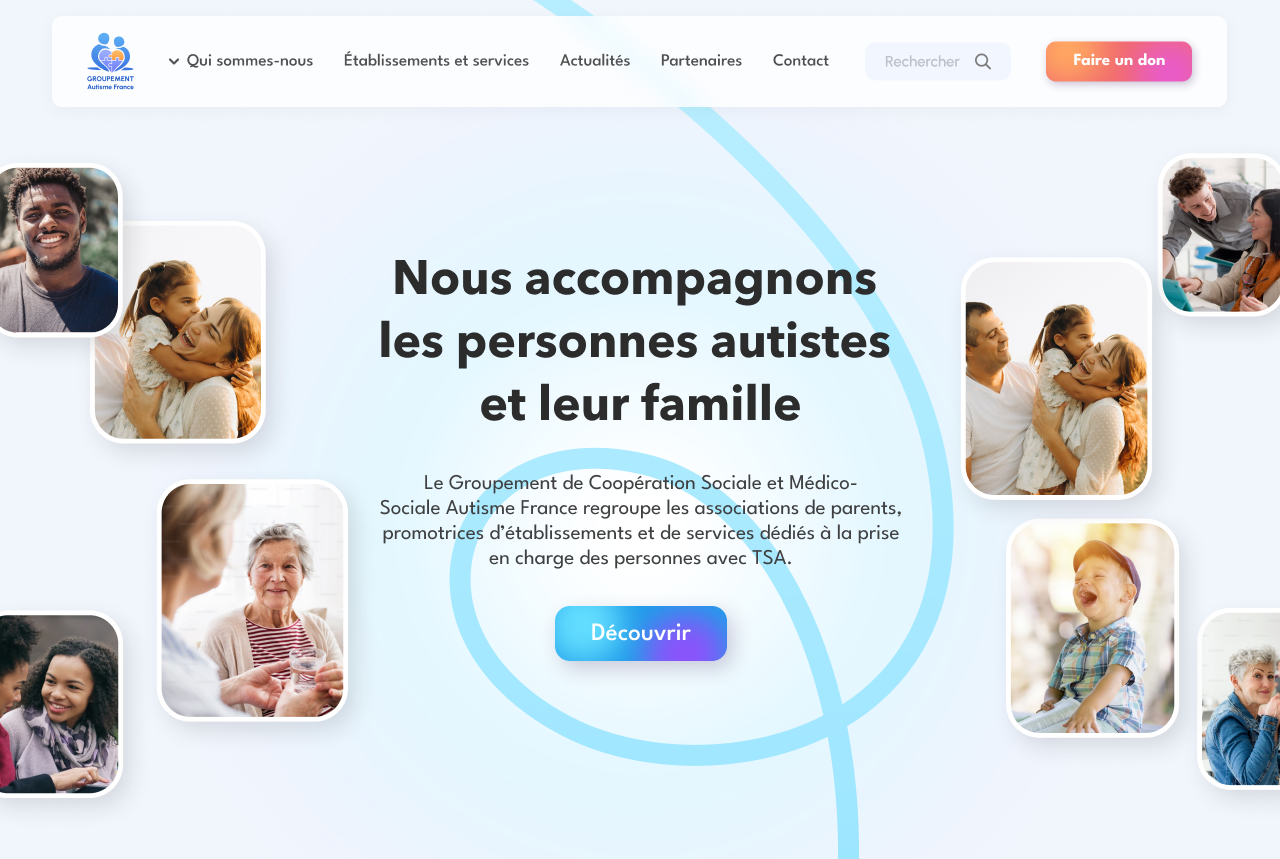
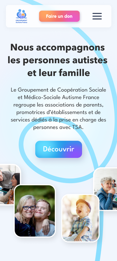
Search, organisations, news and contact details become immediately identifiable entry points.
Each organisation can publish news and make useful documents and resources available.
Families and partners can reach the right person more easily without systematically going through the head office.
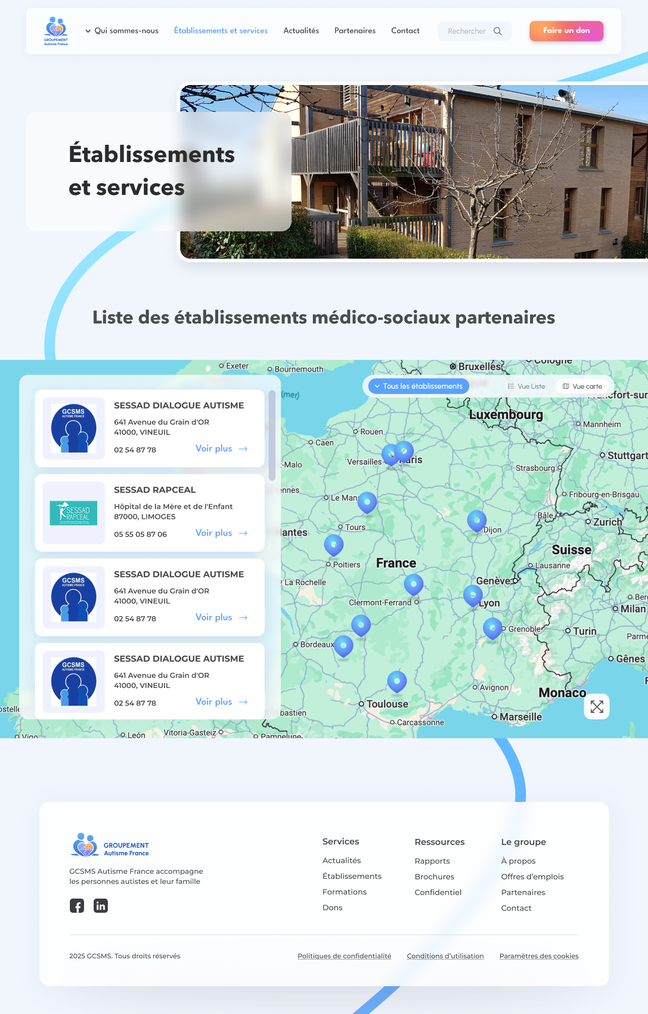
The new map provides an immediate view of all the organisations affiliated with Groupement Autisme France. Moving between the map, list and detailed profiles becomes fluid; every organisation then has a clear space for its contact details, news, gallery and documentary resources.
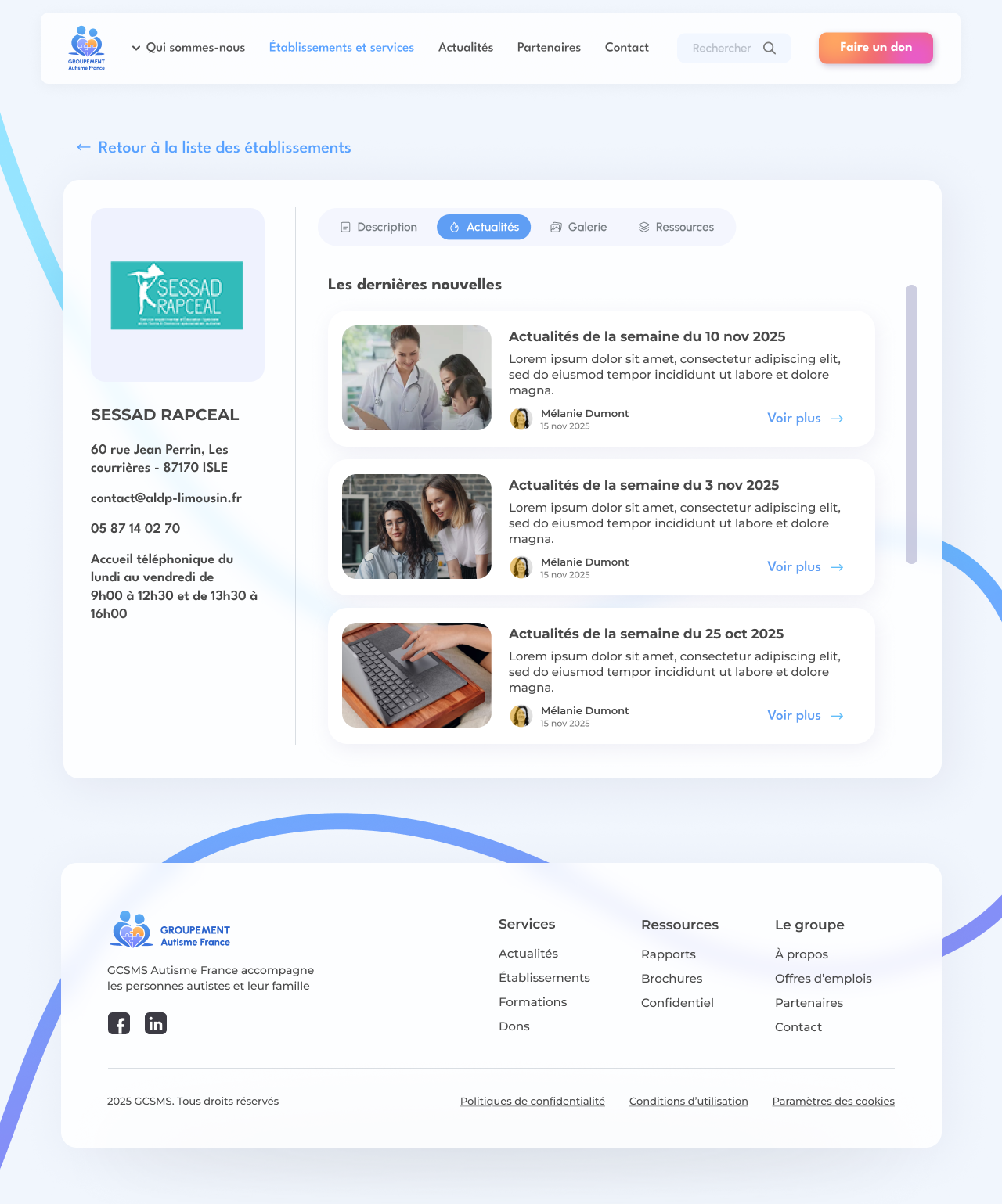
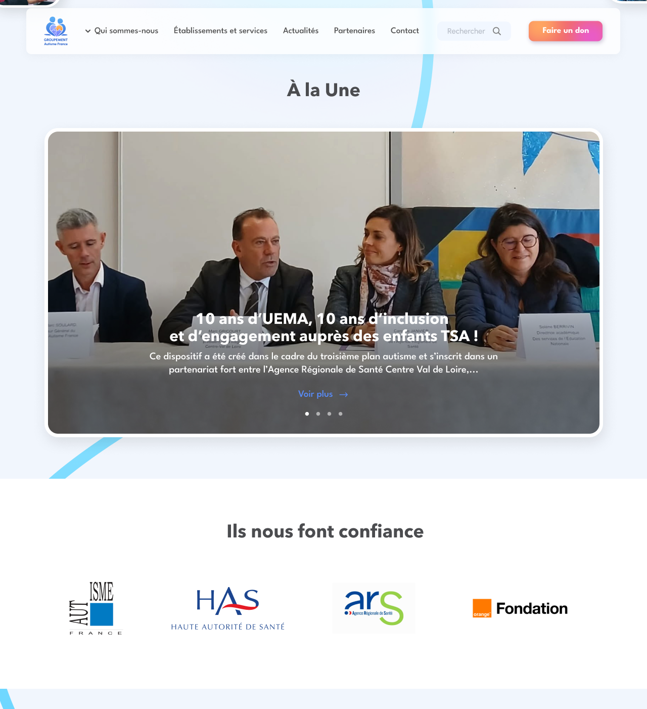
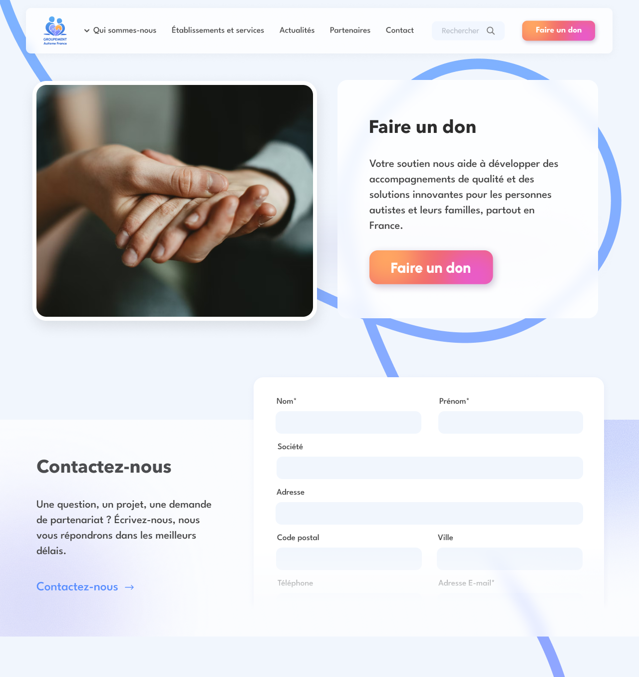
News makes the network’s work more tangible and regular, while donation and contact journeys become more visible and reassuring. The website no longer simply presents the organisation: it supports an action, a search or a conversation.